Here’s the look of shiny app to visualize the temperature trend of major cities of India for the last 200 years. And I am going to write how I made this.
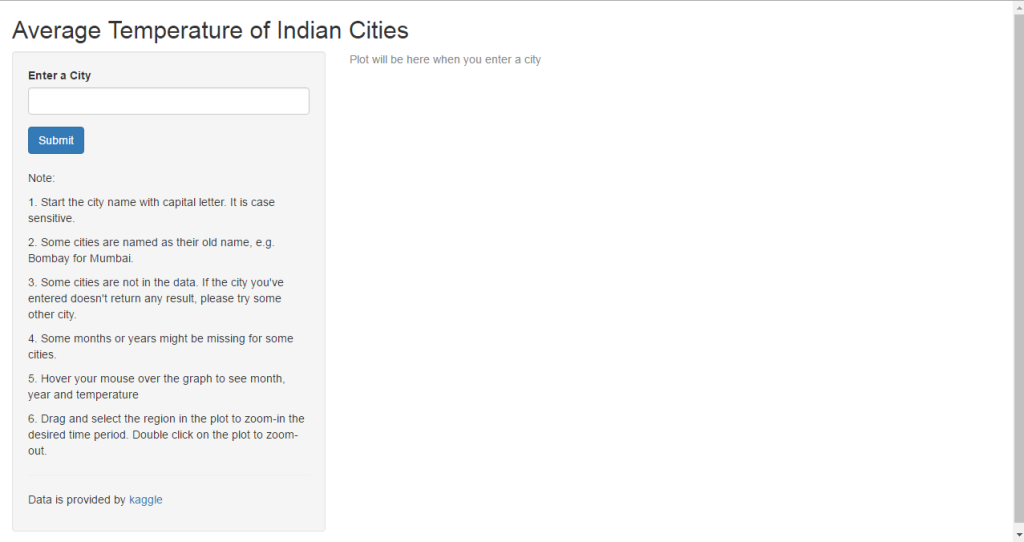
This is the landing page -
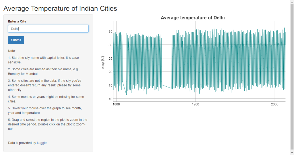
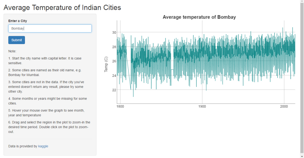
This is what we see after we entered the city name and click on submit -
We will divide the tasks into two -
* Getting and preparing data
* Shiny app
Getting and preparing data
First of all, we need to get the data. The data is available at kaggle. You can download it in your local computer and read it in r as
temp_data <- read.csv("temp_data.csv", stringsAsFactor = FALSE)
I usually read it with data.table package so that I can manipulate data using its functions. Alternatively, if the data is big, I use readr package for fast reading. So if you want to load the data using data.table then this is how you do it.
require(data.table)
temp_data <- fread("temp_data.csv")
Once the data is loaded in r, we can do data exploration like checking out structure, classes, summary, missing values, anything unusual. We can run some of these inbuilt functions to understand the data better.
dim(temp_data) # checking the dimension of data
str(temp_data) # checking classes of features
summary(temp_data) # summarising data feature wise
sapply(temp_data, function(x) sum(is.na(x))) # checking missing values
If we see observations with missing values, we can remove those values.
temp_data <- na.omit(temp_data)
In the beginning I wanted to do this for all the cities listed in the data but the file is about 500 mb, so I decided to do only for Indian cities. Of course, India because I am from India. We subset all the observations where feature Country is listed as India and in data.table, we can do something like this
india <- temp_data[Country == "India", ]
We don’t need all the other features for plotting temperature trend. So we go ahead and select required features such as Date, City name and Temperature data.
india <- india[, c(dt, AverageTemperature, City)]
If we see the class of features in the data, we will notice that the date feature is in character class. We will change that to date class.
india$dt <- as.Date(india$dt, format = "%Y-%m-%d")
We can save this data to our local directory so that we can put this data into the folder from where shiny app is going to launch. In order for shiny app to work, the folder has to have shiny code and the data together.
write.csv(india, "india.csv", row.names = FALSE) # to save the data)
Shiny app
If you are not familiar with shiny, tutorial to learn shiny is available at shiny homepage. Not only tutorial, shiny apps gallery and articles are also available. So much we can learn, so much we can do with shiny. Before we start shiny, we need to install shiny package.
install.packages("shiny")
Once the package is installed, we can run a demo to confirm whether the installation went through smoothly.
require(shiny)
runExample("01_hello")
Shiny app is made of two parts - ui and server. ui is the web page/document that we see. Whatever we want users to see on shiny app is made in ui. The server is the function that powers the shiny app to run. Whatever the users interact with on shiny app ui, it’s the server that helps to execute it seamlessly. So we build the ui and server to get shiny app.
First we will create an empty shiny app. All shiny apps follow the same template.
require(shiny)
ui <- fluidpage()
server <- function(input, output){}
shinyApp(ui = ui, server = server)
To successfully run this app, we have to save it as app.R. And the data should be in the same folder where this app.R is. Once we save it, we will see something like this in our rstudio console.
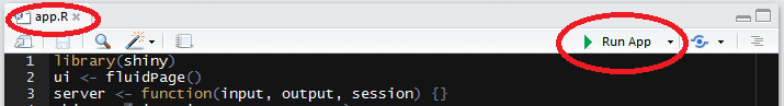
Once you click on Run App button on the right, your app should run.
We will split this part into two-
* UI part
* Server part
UI part
First we add title of the app. Once we add title and run the app, you will see whatever text we have added in the title appears in the app. Interaction options in the app will be in fluidpage function, and to add different options we use different function. For title, this function adds title in the shiny app.
ui <- fluidpage(
       titlePanel("Average Temperature of Indian Cities"),
In the app layout, we will have the option to choose city and display text info on the left, and the remaining part of the layout as dygraph output. So we continue our ui code as follows-
ui <- fluidpage(
       titlePanel("Average Temperture of Indian Cities"),
       sidebarLayout(
         sidebarPanel(
Since our input option is text input, we will have the option to enter text. There are many other input options and controls in shiny. For more info on input options and controls, please see the shiny home page. In our case, we go ahead and add textInput function so that users can enter city name.
ui <- fluidpage(
       titlePanel("Average Temperture of Indian Cities"),
       sidebarLayout(
         sidebarPanel(
          textInput("text", "Enter a City", value = ""),
Here, the moment user enter a city name, instantly the dygraph displays. This we don’t want. We want to have some control like a user enters a city name and click on Submit button, then only dygraph displays. In order to add this feature, we add another line of code.
ui <- fluidpage(
       titlePanel("Average Temperture of Indian Cities"),
       sidebarLayout(
         sidebarPanel(
          textInput("text", "Enter a City", value = ""),
           submitButton("Submit"),
Now, we want to add some texts informing users about this app with a decent space and look. For this we will put line breaks and texts as numbered lists.
ui <- fluidpage(
       titlePanel("Average Temperture of Indian Cities"),
       sidebarLayout(
         sidebarPanel(
          textInput("text", "Enter a City", value = ""),
           submitButton("Submit"),
           br(),
          p("Note:"),
          p("1. Start the city name with capital letter. It is case sensitive. "),
          p("2. Some cities are named as their old name, e.g. Bombay for Mumbai."),
          p("3. Some cities are not in the data. If the city you've entered doesn't
           return any result, please try some other city."),
          p("4. Some months or years might be missing for some cities."),
          p("5. Hover your mouse over the graph to see month, year and temperature"),
          p("6. Drag and select the region in the plot to zoom-in the desired time period. Double click on the plot to zoom-out."),
We also want to add the source of the data - a link url where user can click and take it to the source page of the data provider. I want to put a thin line which parts the above texts and the source link and this can be done in this way
ui <- fluidpage(
       titlePanel("Average Temperture of Indian Cities"),
       sidebarLayout(
         sidebarPanel(
          textInput("text", "Enter a City", value = ""),
           submitButton("Submit"),
           br(),
          p("Note:"),
          p("1. Start the city name with capital letter. It is case sensitive. "),
          p("2. Some cities are named as their old name, e.g. Bombay for Mumbai."),
          p("3. Some cities are not in the data. If the city you've entered doesn't
           return any result, please try some other city."),
          p("4. Some months or years might be missing for some cities."),
          p("5. Hover your mouse over the graph to see month, year and temperature"),
          p("6. Drag and select the region in the plot to zoom-in the desired time period. Double click on the plot to zoom-out."),
           hr(),
        p("Data is provided by", a("kaggle", href = "https://www.kaggle.com/berkeleyearth/climate-change-earth-surface-temperature-data", target = "_blank"))
      ),
Now, the side panel is done. Next is the dygraph output panel. For this we use
mainPanel(
dygraphOutput("dygraph")
Our ui code is complete. The overall ui code looks like this
ui <- fluidPage(
   titlePanel("Average Temperature of Indian Cities"),
   sidebarLayout(
      sidebarPanel(
         textInput("text", "Enter a City", value = ""),
         submitButton("Submit"),
         br(),
         p("Note:"),
         p("1. Start the city name with capital letter. It is case sensitive. "),
         p("2. Some cities are named as their old name, e.g. Bombay for Mumbai."),
         p("3. Some cities are not in the data. If the city you've entered doesn't
           return any result, please try some other city."),
         p("4. Some months or years might be missing for some cities."),
        p("5. Hover your mouse over the graph to see month, year and temperature"),
        p("6. Drag and select the region in the plot to zoom-in the desired time period. Double click on the plot to zoom-out."),
        hr(),
        p("Data is provided by", a("kaggle", href = "https://www.kaggle.com/berkeleyearth/climate-change-earth-surface-temperature-data", target = "_blank"))
      ),
      mainPanel(
         dygraphOutput("dygraph")
      )
   )
)
Server part
The server function comes with two arguments - input and output. input is a list we read values from and output is a list we will write values to. input will contain all the values of all different inputs we have defined in the ui part. Similarly, output is where we will save output objects(in our case - dygraph) to display in our app. Also, whatever we want to achieve with our data, we have to do it in the server part. In our app, the data is in data.table format and in order for dygraph to take this data, we have to change the data into time series format, and we define all these in the server part. To change data table into time series data, we need to load the xts package. And to create time series graphs, we load dygraphs package. We can load all these necessary packages in the beginning of the code. Also, we are going to use reactive function so that everytime a user enter a city and click on submit, the code will automatically bring up the time series graph of that city. So it’s going to look like this for the first few lines.
server <- function(input, output) {
  enter_city <- reactive({
    validate(
      need(input$text != "", "Plot will be here when you enter a city")
       )
When a user land at the app, since the text input is empty, it’ll show an error message instead of graph. So the shiny functions validate and need are used to hide the error message and change it to some meaningful message. In our case, we used “Plot will be here when you enter a city”.
After this, we need to make a condition where the input text(“city”) is picked from the data along with its date and temperature features. Once the selected city data is picked, we have to change it to time series data with just date and temperature feature. But before that, we need to add another validate and need functions to hide error message whenever a user enters a city which is not in the data. We display this message for our app - “City not in the data. Please enter another city”. And up to this the server code look like this.
server <- function(input, output) {
   enter_city <- reactive({
    validate(
      need(input$text != "", "Plot will be here when you enter a city")
       )
    select_city <- subset(india, City == input$text)
    validate(
    need(input$text %in% select_city$City, "City not in the data. Please enter another city.")
    )
   select_city[, .(dt, AverageTemperature)]
   xts(select_city$AverageTemperature, as.Date(select_city$dt, format = "%Y-%m-%d"))
   })
The input text part is done. Now the output part which is a dygraph(time series graph) for any city entered in the text input. We use shiny render function and for dygraph, we need to use particular function renderDygraph. We also want whichever city name is entered to display the name of the city in the graph’s title and the y-label axis name to “Temp (c)”. One good thing about dygraph is that when we mouse over the graph, it’ll display the info of that data point. So in our graph, the label displays at any mouse over point as month, year and temperature value. But instead of temperature, it was showing as V1. So the last line changes the display of temperature from V1 to Temp. With renderDygraph function, the code looks like this.
server <- function(input, output) {
  enter_city <- reactive({
    validate(
      need(input$text != "", "Plot will be here when you enter a city")
       )
    select_city <- subset(india, City == input$text)
    validate(
    need(input$text %in% select_city$City, "City not in the data. Please enter another city.")
    )
   select_city[, .(dt, AverageTemperature)]
   xts(select_city$AverageTemperature, as.Date(select_city$dt, format = "%Y-%m-%d"))
   })
     output$dygraph <- renderDygraph({
     dygraph(enter_city(),
             main = paste("Average temperature of", input$text)) %>%
       dyAxis("y", label = "Temp (C)") %>%
       dySeries("V1", label  = "Temp")
       })
}
And finally to run the application, we need this shinyApp function
shinyApp(ui = ui, server = server)
The final app.R looks like this and is ready to be published.
library(shiny)
library(xts)
library(dygraphs)
library(data.table)

india <- fread("india.csv")

ui <- fluidPage(
   titlePanel("Average Temperature of Indian Cities"),
   sidebarLayout(
      sidebarPanel(
         textInput("text", "Enter a City", value = ""),
         submitButton("Submit"),
         br(),
         p("Note:"),
         p("1. Start the city name with capital letter. It is case sensitive. "),
         p("2. Some cities are named as their old name, e.g. Bombay for Mumbai."),
         p("3. Some cities are not in the data. If the city you've entered doesn't
           return any result, please try some other city."),
         p("4. Some months or years might be missing for some cities."),
        p("5. Hover your mouse over the graph to see month, year and temperature"),
        p("6. Drag and select the region in the plot to zoom-in the desired time period. Double click on the plot to zoom-out."),
        hr(),
        p("Data is provided by", a("kaggle", href = "https://www.kaggle.com/berkeleyearth/climate-change-earth-surface-temperature-data", target = "_blank"))
      ),
      mainPanel(
         dygraphOutput("dygraph")
      )
   )
)


server <- function(input, output) {
  enter_city <- reactive({
    validate(
      need(input$text != "", "Plot will be here when you enter a city")
       )
    select_city <- subset(india, City == input$text)
    validate(
    need(input$text %in% select_city$City, "City not in the data. Please enter another city.")
    )
   select_city[, .(dt, AverageTemperature)]
   xts(select_city$AverageTemperature, as.Date(select_city$dt, format = "%Y-%m-%d"))
   })
     output$dygraph <- renderDygraph({
     dygraph(enter_city(),
             main = paste("Average temperature of", input$text)) %>%
       dyAxis("y", label = "Temp (C)") %>%
         dySeries("V1", label = "Temp")
       })
}

shinyApp(ui = ui, server = server)
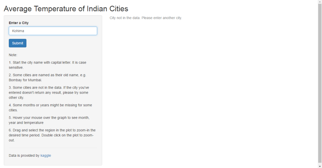
So here is screen shot of the app where a city is entered which is not in the data.
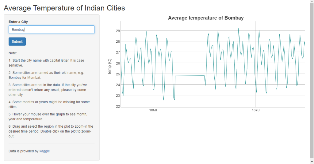
Another feature of dygraph is to zoom-in to the desire time period in the graph. Select a time range by dragging your mouse on the graph to zoom-in. To zoom-out, we can double-click on the graph. Screen shots of the app where the graph is zoomed-in.
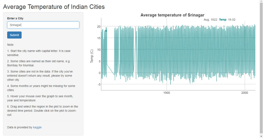
And finally, the screen shot where the mouse is over the graph at a particular point where it displays the label of that point.
To access the app, please click here
Resources
To learn more about shiny and its applications:
* Stackoverflow
* Google group
* Useful articles
* Shiny rmarkdown
* Share your shiny apps online
Once you load the shiny package in your rstudio console, you can always do help function for any shiny function to know its arguments and usage. For example- ?shinyApp, ?validate, ?renderDygraph and so on.
Thank you for reading!