India’s performance in Olympics has always been a lackluster event. Read somewhere that performance of a country in Olympic event is directly correlate to country’s GDP. Maybe true because those countries who tops the Olympic medals table are mostly developed countries. For Indians, if the Indian Olympians could bring some medals, we are happy. Because we are one sports nation - Cricket. This game is a religion in our country and the cricket players are God. Fortunate are those sportsmen who made into cricket. Sportsmen in other games go through a lot of hurdles and the rides are not smooth to reach the tops. Few sportsmen like Viswanathan Anand, Mary Kom, Sania Mirza, Saina Nehwal, Vijender Singh and Sunil Chhetri from other sports made their names but don’t get similar fame and perks of a famous cricketer. So every time during the Olympics, there will be debates and discussions on every media stating why India struggles so much to earn medals in the Olympics. There could be many reasons which need to fix for India to perform in the Olympics. I am more interested in the information part of the Indian Olympics. I have searched data from various sources on the web, copied data from Wikipedia posts to visualize data so that I can get a better understanding of the data.
Like my other posts, I am going to post this as a tutorial kind of. I am going to add the codes on how I have copied the data from Wikipedia site, how I generated the plots and maps.
Just like any R code begins, we load the require libraries first.
require(rvest) # to copy data table from html pages
require(dplyr) # for data wrangling
require(ggplot2) # for visualization
require(tidyr) # for data transformation
require(plyr) # for assisting data transformation in visualization
Getting and Transforming Data
The data table for events participating by Indian athletes in Rio Olympics 2015 is available here,
and with the help rvest package, we will transfer the table to R.
wikiLink <- read_html("https://en.wikipedia.org/wiki/India_at_the_2016_Summer_Olympics")

eventList <- wikiLink %>%
  html_nodes("table") %>%
  .[[3]] %>%
  html_table()
We first save as an object the wiki URL where the table is. Then point the number of the table in the page and load it in R. Go ahead and save the transferred table to your local disk.
write.csv(eventList, "events.csv", row.names = FALSE)
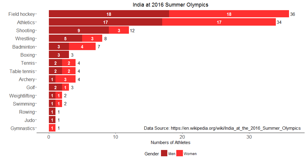
Here’re the first few rows of the table.
| Sports | Men | Women | Total | Events |
|---|---|---|---|---|
| Archery | 1 | 3 | 4 | 3 |
| Athletics | 17 | 17 | 34 | 20 |
| Badminton | 3 | 4 | 7 | 4 |
| Boxing | 3 | 0 | 3 | 3 |
| Field Hockey | 18 | 18 | 36 | 2 |
| Golf | 2 | 1 | 3 | 2 |
We can drop the feature Events and drop the row which is Total and arrange the table by Total in descending. Note that there is a row in the Sports feature call Total which sums the number of Men, Women and Total features.
events <- select(eventList, Sports, Men, Women, Total)
events <- select(events, Sports, Men, Women, Total)
events <- filter(events, Sports != "Total")
events <- arrange(events, desc(Total))
In order to make our desire plot, I need to make some transformation on data with the help of tidyr package- from wide format of the table to long format of the table.
eventsLong <- gather(events, "Gender", "Number", 2:3)
Here I have made a new feature call Gender which will take Men and Women features from events data and another new feature call Number which will count the number of each gender in their respective sports events. 2:3 is the selection of columns that we want to transform. The new table looks like this-
| Sports | Total | Gender | Number |
|---|---|---|---|
| Field Hockey | 36 | Men | 18 |
| Athletics | 34 | Men | 17 |
| Shooting | 12 | Men | 9 |
| Wrestling | 8 | Men | 5 |
| Badminton | 7 | Men | 3 |
| Archery | 4 | Men | 1 |
While transforming the table into long format, we have generated quite a few rows with 0 in the Number feature. We will remove all those rows.
eventsLong <- filter(eventsLong, Number != 0)
Visualizing Data
While making stacked bar plot, I have struggled to keep the value of each bar in the center previously. With the help from a StackOverFlow answer, I was able to fix it.
newList <- ddply(eventsLong, .(Sports), transform,
                 pos = cumsum(Number) - (0.5 * Number))
This is the complete code to generate the stacked bar plot of Olympic events that Indian athletes are going to participate.
bp <-
ggplot(newList, aes(x = reorder(Sports, Number), y = Number, fill = Gender)) +
  geom_bar(stat = "identity") +
  coord_flip() +
  ggtitle("India at 2016 Summer Olympics") +
  labs(x = "", y = "Numbers of Athletes") +
  geom_text(aes(x = Sports, y = pos, label = Number), size = 4,
            colour = "white", fontface = "bold") +
  annotate("text", x = 1, y = 26,
           label = "Data Source: https://en.wikipedia.org/wiki/India_at_the_2016_Summer_Olympics") +
  scale_fill_manual(values = c("firebrick", "firebrick1")) +
  theme(legend.position = "bottom",
        legend.direction = "horizontal",
        panel.background = element_blank(),
        axis.line.x = element_line(size = .6, colour = "black"),
        axis.text = element_text(size = 12))

bp + geom_text(aes(x = Sports, y = Total + 0.5, label = Total, fill = NULL),
               size = 4, data = events)
The above code generate this plot below.
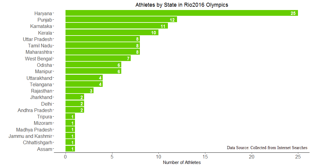
The next visualization is about how many athletes are from which state. There was no ready-made data available on the web. So I had to dig individual athlete’s profile to find their state. After compiling the data, the first few rows look like this.
| Athlete | Game | Gender | City | State |
|---|---|---|---|---|
| Deepika Kumari | Archery | Female | Ranchi | State |
| Laxmi Rani Manjhi | Archery | Female | Chittaranjan | West Bengal |
| Bombayla Devi Laishram | Archery | Female | Imphal East | Manipur |
| Atanu Das | Archery | Male | Kolkata | West Bengal |
| Dharambir Singh | Athletics | Male | Rohtak | Haryana |
| Mohammad Anas Yahiya | Athletics | Male | Nilamel | Kerala |
I need to count the number of athletes state-wise. First load the data and then summarise count, group by state.
athletesHome <- read.csv("athletesHometown.csv")

state_athletes <- athletesHome %>%
  group_by(State) %>%
  summarise(Count = n()) %>%
  arrange(desc(Count))
Few rows from the new data state_athletes
| State | Count |
|---|---|
| Haryana | 25 |
| Punjab | 12 |
| Karnataka | 11 |
| Kerala | 10 |
| Maharastra | 8 |
| Tamil Nadu | 8 |
To visualize this data, we run the code below
ggplot(state_athletes, aes(x = reorder(State, Count), y = Count)) +
  geom_bar(stat = "identity", fill = "chartreuse3") +
  coord_flip() +
  ggtitle("Athletes by State in Rio2016 Olympics") +
  labs(x = "", y = "Number of Athletes") +
  geom_text(aes(label = Count), hjust = 1.5, colour = "white",
            fontface = "bold") +
  theme(panel.background = element_blank(),
        axis.line.x = element_line(size = .6, colour = "black"),
        axis.text = element_text(size = 12))
And we get this plot
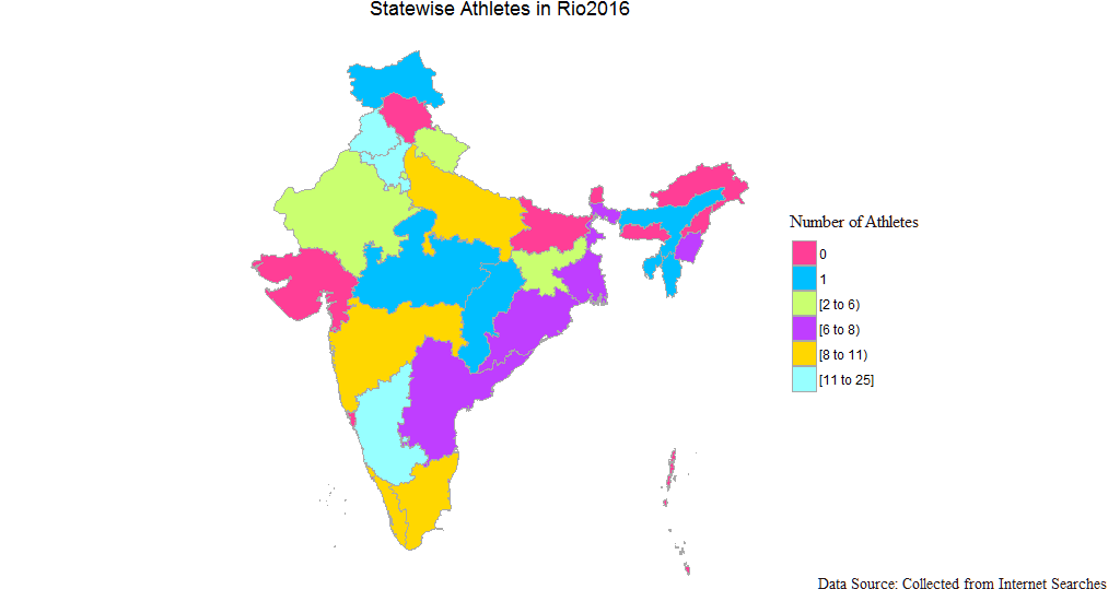
In another way to visualize the same data, we can fill the value of each state in India map as well. For this we need to load some more packages.
require(choroplethr) # to map
require(choroplethrAdmin1) # for India map
We load India map with this line of code below and remove the country feature from the data frame.
india <- get_admin1_regions("india")
india$country <- NULL
Just need to add the value column in the india data frame. This value is the number of athletes participated from each state. Note that the india data frame comes with state names in their own style. I have just inserted the value with the matching state names. Also, the new column has to be named value as per this mapping package.
india$value <- c(2, 6, 0, 1, 0, 1, 0, 0, 25, 0, 1, 2, 11, 10, 1, 8, 6, 0, 1, 0, 6, 12, 3, 0, 8, 1, 8, 4,
                    7, 0,0,0,0,0,0)
Once we add the value data, we can generate the desired map with this code.
admin1_choropleth(country.name = "india",
                  df = india,
                  title = "Statewise Athletes in Rio2016",
                  legend = "",
                  num_colors = 9) +
  scale_fill_manual(values = c("violetred1", "deepskyblue",
                               "darkolivegreen1", "darkorchid1",
                               "gold", "darkslategray1")) +
  theme(legend.title = element_blank())
And we get this beautiful map-
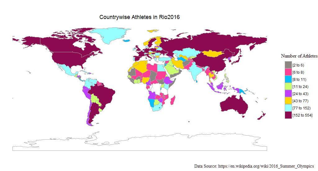
While constructing these visualizations I also thought of visualizing number of athletes from all the countries participating in this Rio Olympics. To construct a world map colouring the countries by number of athletes participating, we first get the data and clean the data.
Getting and Cleaning of Olympic Countries Data
The data is available at this wiki page. The table we want is no.9. So the code goes like this-
link <- read_html("https://en.wikipedia.org/wiki/2016_Summer_Olympics")

team <- link %>%
  html_nodes("table") %>%
  .[[9]] %>%
  html_table()
This data required some cleaning, so I went head and cleaned the data and saved it in my local disk. I have also used stringr package on top of base package to clean the data.
teams <- team
teams <- str_split(teams, "\\n")
teams <- as.data.frame(teams)
names(teams) <- c("Country")
teams$Country <- gsub("[[:punct:]]", "", teams$Country)
Athletes <- strsplit(teams$Country, "[^[:digit:]]")
athletes <- as.numeric(unlist(Athletes))
athletes <- athletes[!is.na(athletes)]
teams$Athletes <- athletes
country <- strsplit(teams$Country, "[[:digit:]]")
nations <- as.character(unlist(country))
nations <- str_trim(nations, side = "right")
nations <- nations[nations != ""]
nations <- nations[nations != " host"]
teams$Countries <- nations
teams$Country <- NULL
teams <- teams[, c(2,1)]
write.csv(teams, "teams.csv", row.names = FALSE)
rm(list = ls())
We reload the data from the local disk.
setwd("..\\rio2016\\Data")
country <- read.csv("teams.csv")
The first few rows
| Countries | Athletes |
|---|---|
| Afghanistan | 3 |
| Albania | 6 |
| Algeria | 67 |
| American Samoa | 4 |
| Andorra | 5 |
| Angola | 25 |
Some of the small countries are left out because the package doesn’t have mapping features for these small countries.
In order to draw world map, we also need another package
require(choroplethrMaps)
And we make some changes with country names to match the country names which are already in the package.
names(country) <- c("region", "value")
country$region <- tolower(country$region)
country[198, 1] <- "united states of america"
country[73, 1] <- "united kingdom"
country[69, 1] <- "gambia"
country[79, 1] <- "guinea bissau"
After making the changes, the code below draws the world map
country_choropleth(country,
                   title = "Countrywise Athletes in Rio2016",
                   num_colors = 8) +
  scale_fill_manual(values = c("seashell4","violetred1", "deepskyblue",
                               "darkolivegreen1", "darkorchid1",
                               "gold", "darkslategray1", "deeppink4"))+
  theme(legend.title = element_blank())
We get this beautiful world map with colourised countries showing their athletes count.
The cleaned data is available in this github repo.
To know more about Indian Olympians performance in the history of Summer Olympics, visit this wiki page. More than other information, it has data on medals won by India, year, medals by sports and list of medalists. The best Olympic games we had was in 2012 London Olympics with 6 medals. And not surprise to know that we had 6 Olympics with no medal at all. I hope this doesn’t repeat in Rio2016. The maximum medals was earned in field hockey with 11 medals which include 8 gold, 1 silver and 2 bronze. That is why field hockey is our national game. Field hockey is followed by shooting and wrestling with 4 medals each. Apart from field hockey, the only game which won gold for India in Olympic games is shooting by Abhinav Bindra in 2008 Beijing Olympic.
Thanks for taking out time to read the post!
Note: Some annotations in the plots are done with photo editing tool.