This tutorial is on the line with visualization tutorial that I am doing using ggplot2 package. I have done on how to construct bar plot
with ggplot2 package in my earlier post. All the post are meant for new learners. I do often stuck at choosing dataset for my tutorial.
After few thoughts, I have decided to use kaggle dataset on Bike Sharing Demand. Like
everyone else, I have also started participating kaggle competition with Titanic and at that time I had no idea what I was doing. My
actual initial learning started with Bike Sharing Demand competition. Though there were multiple datasets in Bike Sharing Demand
competition, I am going to use a dataset call ‘Day’.
I load all the libraries needed, set the directory and load the data from the local disk.
require(dplyr) # for data manipulation
require(ggplot2) # for visualization
require(extrafont) # for font change in visualization

setwd("..\\Kaggle\\Bike Sharing\\Data")

day <- read.csv("day.csv", stringsAsFactors = FALSE)
Let’s see what are all the features data came with.
names(day)
 [1] "instant"    "dteday"     "season"     "yr"         "mnth"
 [6] "holiday"    "weekday"    "workingday" "weathersit" "temp"
[11] "atemp"      "hum"        "windspeed"  "casual"     "registered"
[16] "cnt"
I need “dteday” and “cnt” for constructing line plot. “dteday” is date and “cnt” is the total bike rental count. Let’s check the structure of the data as well.
str(day)
'data.frame':	731 obs. of  16 variables:
 $ instant   : int  1 2 3 4 5 6 7 8 9 10 ...
 $ dteday    : chr  "2011-01-01" "2011-01-02" "2011-01-03" "2011-01-04" ...
 $ season    : int  1 1 1 1 1 1 1 1 1 1 ...
 $ yr        : int  0 0 0 0 0 0 0 0 0 0 ...
 $ mnth      : int  1 1 1 1 1 1 1 1 1 1 ...
 $ holiday   : int  0 0 0 0 0 0 0 0 0 0 ...
 $ weekday   : int  6 0 1 2 3 4 5 6 0 1 ...
 $ workingday: int  0 0 1 1 1 1 1 0 0 1 ...
 $ weathersit: int  2 2 1 1 1 1 2 2 1 1 ...
 $ temp      : num  0.344 0.363 0.196 0.2 0.227 ...
 $ atemp     : num  0.364 0.354 0.189 0.212 0.229 ...
 $ hum       : num  0.806 0.696 0.437 0.59 0.437 ...
 $ windspeed : num  0.16 0.249 0.248 0.16 0.187 ...
 $ casual    : int  331 131 120 108 82 88 148 68 54 41 ...
 $ registered: int  654 670 1229 1454 1518 1518 1362 891 768 1280 ...
 $ cnt       : int  985 801 1349 1562 1600 1606 1510 959 822 1321 ...
Since “dteday” is in character class, we need to change it to date class so that we can extract “month” and “year” features to construct our line plot.
day$dteday <- as.Date(day$dteday) # change date to date class
day$month <- format(day$dteday, "%m") # extracted month feature from dteday
day$month <- as.numeric(day$month) # change to numeric
day$year <- format(day$dteday, "%Y") # extracted year from dteday
Let’s see the new added features.
str(day)
'data.frame':	731 obs. of  18 variables:
 $ instant   : int  1 2 3 4 5 6 7 8 9 10 ...
 $ dteday    : Date, format: "2011-01-01" ...
 $ season    : int  1 1 1 1 1 1 1 1 1 1 ...
 $ yr        : int  0 0 0 0 0 0 0 0 0 0 ...
 $ mnth      : int  1 1 1 1 1 1 1 1 1 1 ...
 $ holiday   : int  0 0 0 0 0 0 0 0 0 0 ...
 $ weekday   : int  6 0 1 2 3 4 5 6 0 1 ...
 $ workingday: int  0 0 1 1 1 1 1 0 0 1 ...
 $ weathersit: int  2 2 1 1 1 1 2 2 1 1 ...
 $ temp      : num  0.344 0.363 0.196 0.2 0.227 ...
 $ atemp     : num  0.364 0.354 0.189 0.212 0.229 ...
 $ hum       : num  0.806 0.696 0.437 0.59 0.437 ...
 $ windspeed : num  0.16 0.249 0.248 0.16 0.187 ...
 $ casual    : int  331 131 120 108 82 88 148 68 54 41 ...
 $ registered: int  654 670 1229 1454 1518 1518 1362 891 768 1280 ...
 $ cnt       : int  985 801 1349 1562 1600 1606 1510 959 822 1321 ...
 $ month     : num  1 1 1 1 1 1 1 1 1 1 ...
 $ year      : chr  "2011" "2011" "2011" "2011" ...
This is what I want from my line plot - I want to see the sum of bike rental count by month for the year 2011 and 2012. In order to achieve this we need to group the data by year and then by month, sum the bike rental count for each month.
newDay <- day %>%
  group_by(year, month) %>%
  summarise(Total = sum(cnt))
This is how it looks.
head(newDay)
Source: local data frame [6 x 3]
Groups: year [1]

   year month  Total
  <chr> <dbl>  <int>
1  2011     1  38189
2  2011     2  48215
3  2011     3  64045
4  2011     4  94870
5  2011     5 135821
6  2011     6 143512
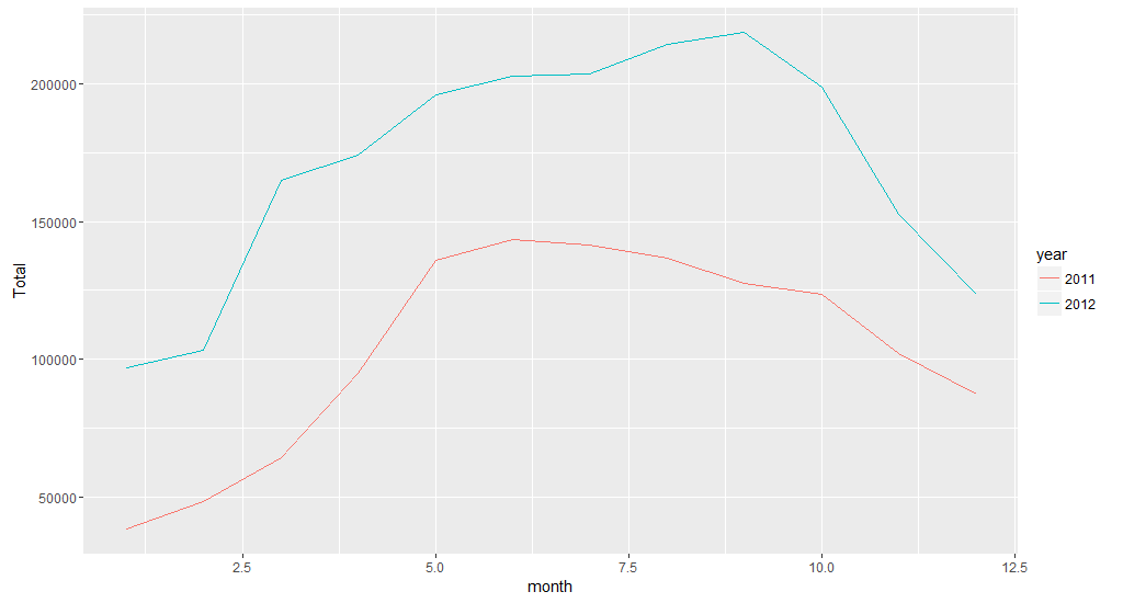
The data is ready and the first line plot is below.
ggplot(newDay, aes(x = month, y = Total, colour = year)) +
  geom_line(stat = "identity")
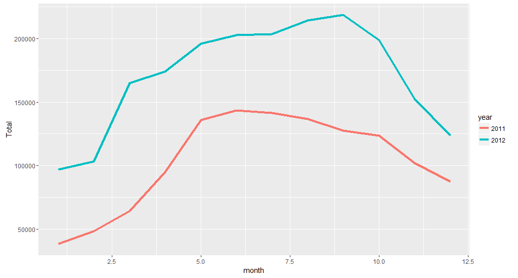
The lines look little thin. So we make it little thick. I am going to add ### for every new line of code.
ggplot(newDay, aes(x = month, y = Total, colour = year)) +
  geom_line(stat = "identity", size = 1.5) ###
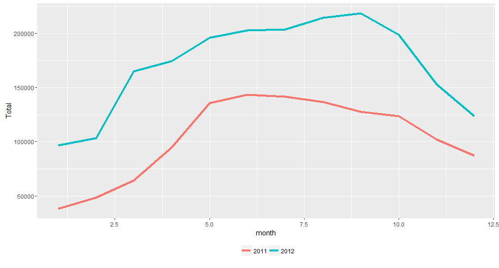
I prefer legend at the bottom
ggplot(newDay, aes(x = month, y = Total, colour = year)) +
  geom_line(stat = "identity", size = 1.5) +
  theme(legend.position = "bottom", ###
        legend.direction = "horizontal", ###
        legend.title = element_blank()) ###
The x-axis label is not proper. So we make it proper
ggplot(newDay, aes(x = month, y = Total, colour = year)) +
  geom_line(stat = "identity", size = 1.5) +
  scale_x_continuous(breaks = seq(1,12,1)) + ###
  theme(legend.position = "bottom",
        legend.direction = "horizontal",
        legend.title = element_blank())

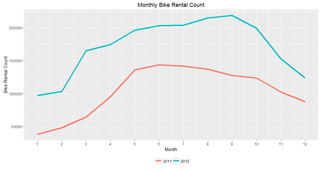
We add plot title and properly name axes titles too.
ggplot(newDay, aes(x = month, y = Total, colour = year)) +
  geom_line(stat = "identity", size = 1.5) +
  scale_x_continuous(breaks = seq(1,12,1)) +
  ggtitle("Monthly Bike Rental Count") + ###
  labs(x = "Month", y = "Bike Rental Count") + ###
  theme(legend.position = "bottom",
        legend.direction = "horizontal",
        legend.title = element_blank())
Change the colour of the lines
ggplot(newDay, aes(x = month, y = Total, colour = year)) +
  geom_line(stat = "identity", size = 1.5) +
  scale_x_continuous(breaks = seq(1,12,1)) +
  scale_color_manual(values = c("darkslategray", "gold")) + ###
  ggtitle("Monthly Bike Rental Count") +
  labs(x = "Month", y = "Bike Rental Count") +
  theme(legend.position = "bottom",
        legend.direction = "horizontal",
        legend.title = element_blank())
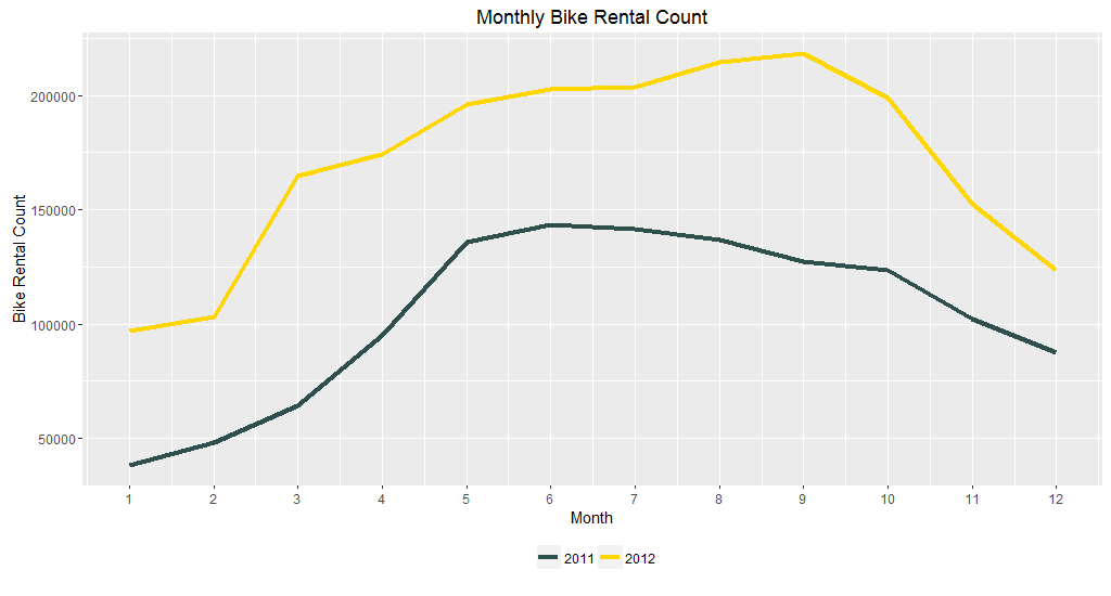
Remove the grey background
ggplot(newDay, aes(x = month, y = Total, colour = year)) +
  geom_line(stat = "identity", size = 1.5) +
  scale_x_continuous(breaks = seq(1,12,1)) +
  scale_color_manual(values = c("darkslategray", "gold")) +
  ggtitle("Monthly Bike Rental Count") +
  labs(x = "Month", y = "Bike Rental Count") +
  theme_bw() + ###
  theme(legend.position = "bottom",
        legend.direction = "horizontal",
        legend.title = element_blank())
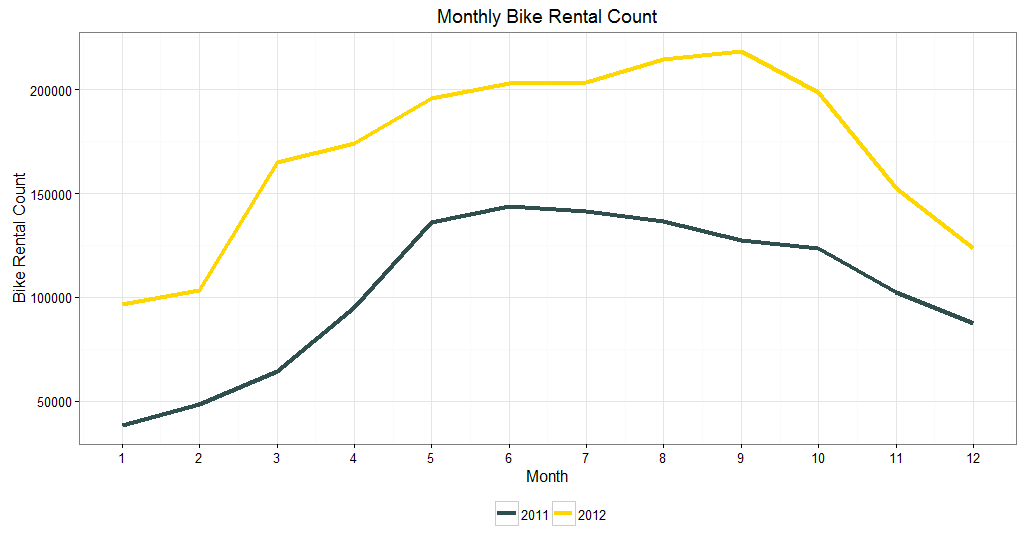
I want to remove the minor gridline and keep just major gridline.
ggplot(newDay, aes(x = month, y = Total, colour = year)) +
  geom_line(stat = "identity", size = 1.5) +
  scale_x_continuous(breaks = seq(1,12,1)) +
  scale_color_manual(values = c("darkslategray", "gold")) +
  ggtitle("Monthly Bike Rental Count") +
  labs(x = "Month", y = "Bike Rental Count") +
  theme_bw() +
  theme(legend.position = "bottom",
        legend.direction = "horizontal",
        legend.title = element_blank(),
        panel.grid.minor = element_blank()) ###

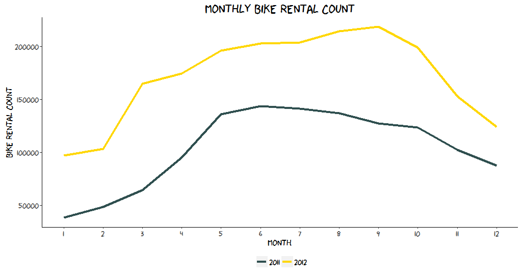
We can change the font to xkcd and turn the plot theme into xkcd theme. For this we need to load the extrafont package
require(extrafont)
windowsFonts(xkcd=windowsFont("xkcd"))
ggplot(newDay, aes(x = month, y = Total, colour = year)) +
  geom_line(stat = "identity", size = 1.5) +
  scale_x_continuous(breaks = seq(1,12,1)) +
  scale_color_manual(values = c("darkslategray", "gold")) +
  ggtitle("Monthly Bike Rental Count") +
  labs(x = "Month", y = "Bike Rental Count") +
  theme(legend.position = "bottom",
        legend.direction = "horizontal",
        legend.title = element_blank(),
        legend.text = element_text(size = 12),
        plot.title = element_text(size = 20, family = "xkcd"),
        text = element_text(family = "xkcd"),
        axis.text = element_text(size = 12),
        axis.title = element_text(size = 14),
        panel.background = element_blank(),
        axis.line.x = element_line(size = .5, colour = "black"),
        axis.line.y = element_line(size = .5, colour = "black"))
Thanks for reading out. Hope this will help you to construct a line plot using ggplot2 package easily.